Thursday, March 26, 2009

Card: "Cup(Birthday)Cake" [Birthday]

Who: For my friend's birthday [yesterday] in which she mentioned that she'd be a good cupcake baker for some reason when we talked over coffee this past Monday.

What: Along with a cupcake baking kit [giant cupcake pan, paper cupcake holders, and book], this is the card that will be accompanying her gifts. The cupcake design is hand drawn and painted in Photoshop.


Why: When talking on that Monday, I mentioned how it would be cool to have a potluck with our grammar school friends. I'm just trying to tell her straight up to share the wealth once she gets good baking em.

Monday, March 23, 2009

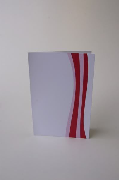
Product: "Bake On"

The bacon graphic was designed in Photoshop using heavily stroked lines. I failed effortlessly trying to hand draw it with my tablet.
Front of the card with full bacon graphic.
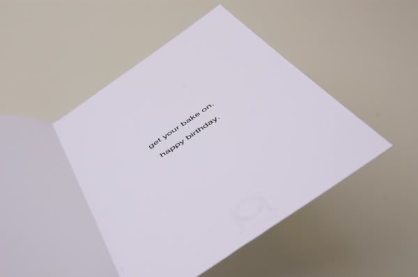
Inside reads "Get your bake on." Full explanation can be read on "Bake On"'s original post here.

"Bake On".

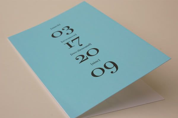
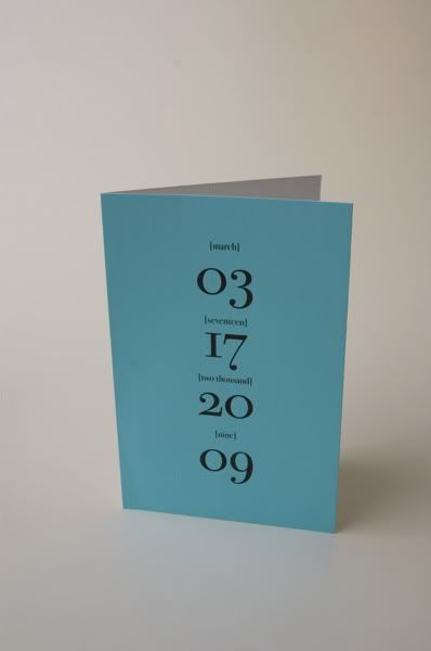
Product: "03172009"

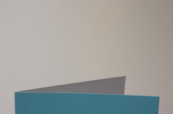
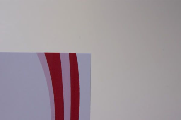
Here's a card that I printed full bleed in which I rarely do. But this looked especially good with the light teal/blue card.
"03172009" original design posted blogged about here.


"03172009"

Product: "Catch Her in Time"

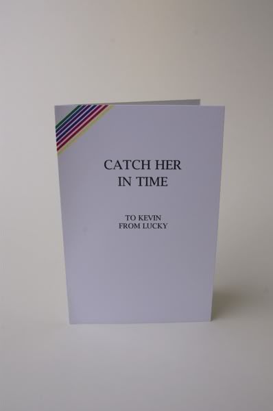
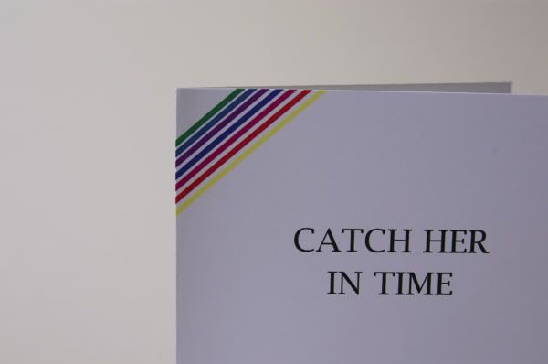
An actual print out from the design "Catch Her in Time" made for a friend. Design originally posted here.


"Catch Her in Time"

Product: "Wavello"

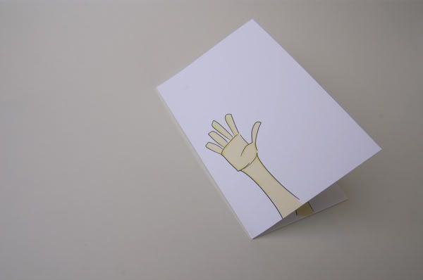
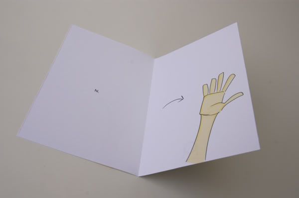
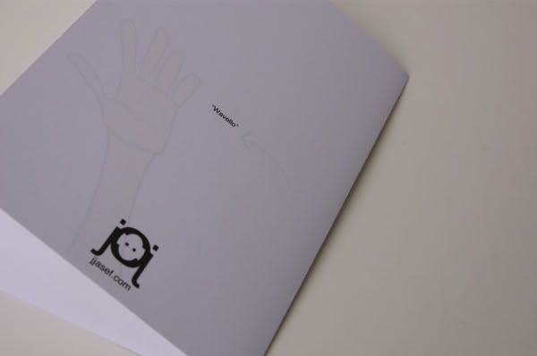
Another general card to give, the card's illustration is a hand in the front and once you flip it, the hand inside moves as if waving. Reminded me of those sketches that move when you flip the pages fast enough so this
Inside left simply reads "hi."
Your message can be written across the top and below the text.

"Wavello"

Product: "Are(Y)ou"

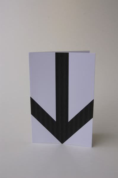
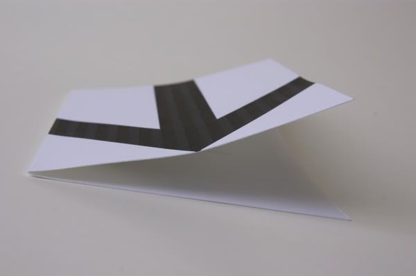
A card design I made earlier in the year. It's a general card in which you can send anytime. The giant arrow on the face of the card is pointing to the recipient.
Ok I'll admit: my printer is losing ink so there is banding... which is not part of the design! Nevertheless, this printout shows you the premise of the card.
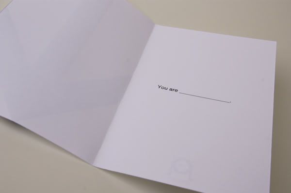
Inside, "You are______" is printed and the sender can put anything [s]he wants. For example, "You are thoughtful" or "You are such a loser." So really, anything you want. haha
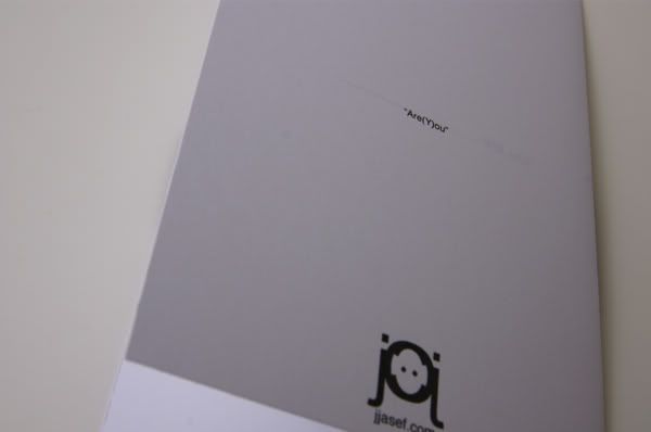
On the backs of all the cards are the titles printed.

Friday, March 20, 2009

Card: "Bake On" [Birthday]

Who: My friend's birthday is coming up and she has a likening for bacon products. She's laughed at bacon novelties such as band aid branded bacon or bacon floss.

What: Bacon. You see it right.
Why: The tagline is "Get your bake on." because the gift I'm giving is a cupcake pan and book. We got those designer cupcakes in which they cost much and so learning how to bake em will save money. Ya dig.

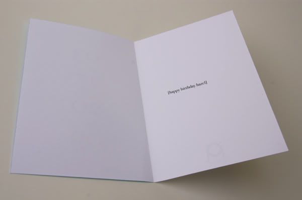
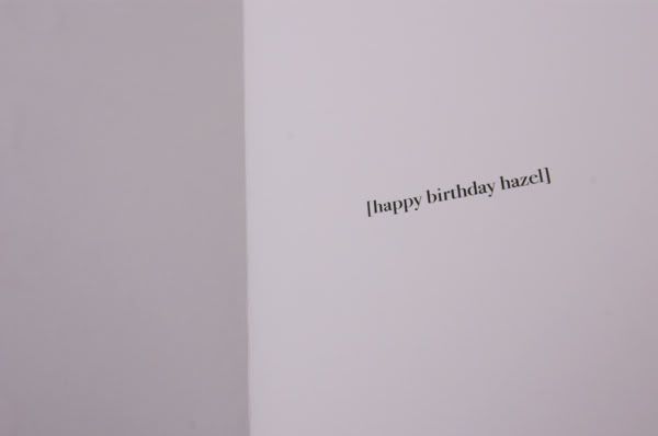
Card: "03172009" [Birthday]

Who: It was my friend's birthday from high school [who's my girlfriend's closest friend]. She is having a dinner tomorrow night and we are all having dinner and this is the card that will accompany her gift.

What: Simple design using numerical type for her birthday "03 17 2009" Colored background to add some color

Why: Text is added just to make sure it's crystal clear--"march seventeen two thousand nine". Inside it reads "happy birthday hazel"

Tuesday, March 17, 2009

Card: "Catch Her in Time" [Gift Card]


Who:
My friend needed a card to give to her friend in which she was giving Catcher in the Rye, and so naturally wanted a card's theme around that.

What: She explained that he really cares for his niece and that one day when she's old enough, wants to give her his copy of his [annotated] copy of the book. My friend explained as well that the book really meant a lot for him considering he pictured himself in the book. Lastly, she said that he wants to keep her from harm and keep her from falling to a life that she isn't fit to live in.

Why: I googled Catcher in the Rye and I remember I too have the classic cover of this book. It's simple white book with colored bands in the upper left corner left the title free and clean to read. I used a play of words and placed "Catch Her in Time" partly due her friend wanting to keep his niece in check. Instead of "J.D. Salinger" I put the To and From.

I love using play of words when I can and I think this fits in rightly so.

Saturday, March 14, 2009

Resume: Cover [In Progress]

Click to enlarge

I'm currently redoing my [general] resume while adding my design to it for a visual flair. I'm applying for this health related job over the summer--a paid internship [which I could really use the money] and wanted to make sure I leave a good impression.

I'll post my resume as soon as it's completed.

Tuesday, March 3, 2009

Poster: "Roots"


click to enlarge

Who: My friend Catherine was asking for some design help for an ad she needed for a class.
What: Her concept was that she lived in 3 different places and has gained unique experiences from there. My take is that she has grown from those experiences which has provided her roots in order for her to grow and mature as a person. Her text [her explanation of what she's gained from those 3 different experiences] were to be placed on the bottom.
Why: I've been studying and surveying typography lately and I got inspired and here's my approach to using type to convey a picture. Her initials "C A" are used as the outline of the tree while her first name are the branches. Her last name is the trunk and lastly { conveys the roots. The space below was to leave enough room for her text.